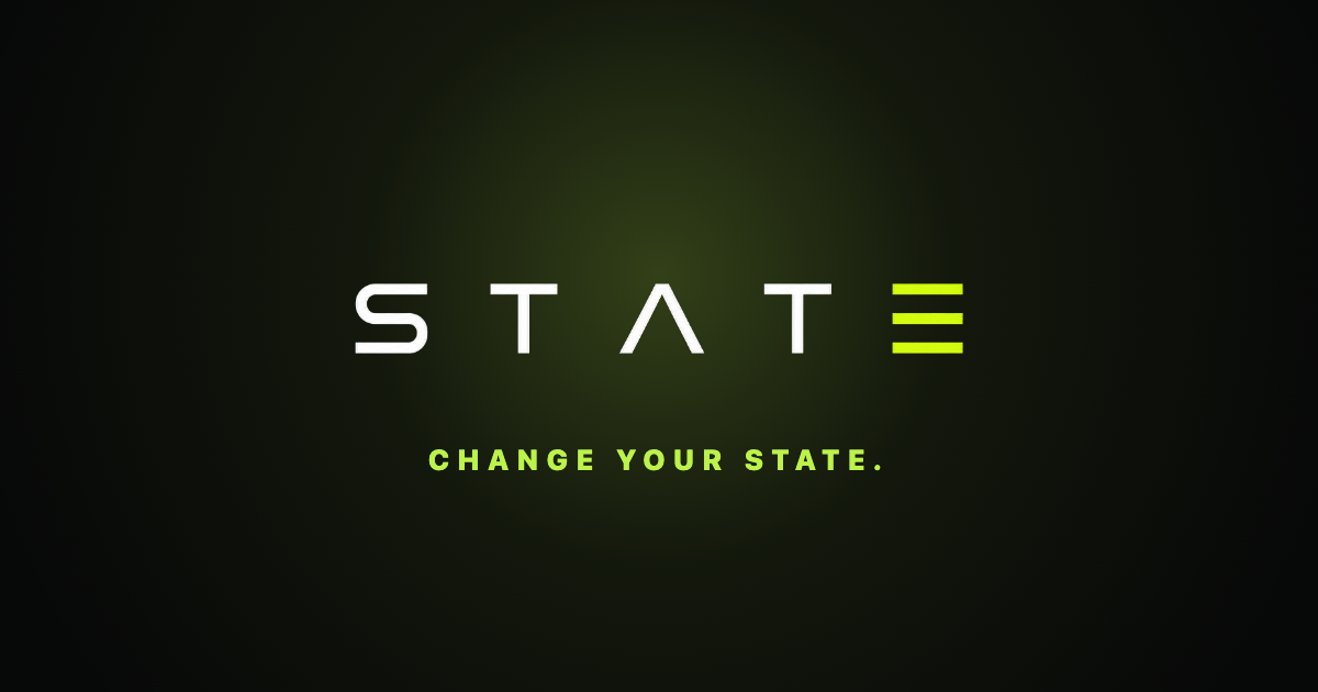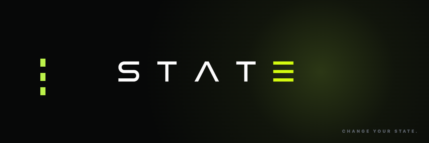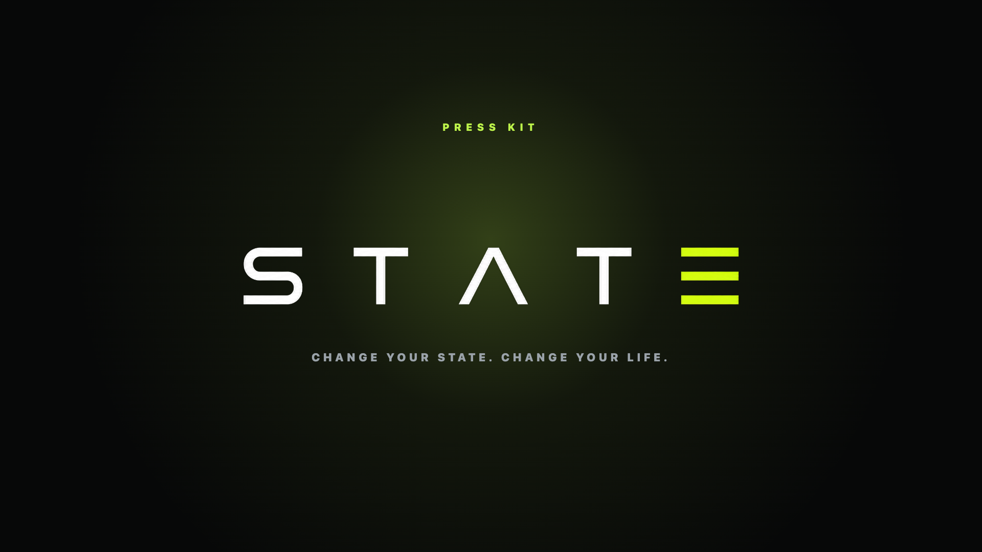

Change your state. Change your life.
Most apps shout in every color. STATE earns attention with one.
Green is the only brand hue. It means interactive, positive, progress — and nothing else. Because it is rare, it pops.
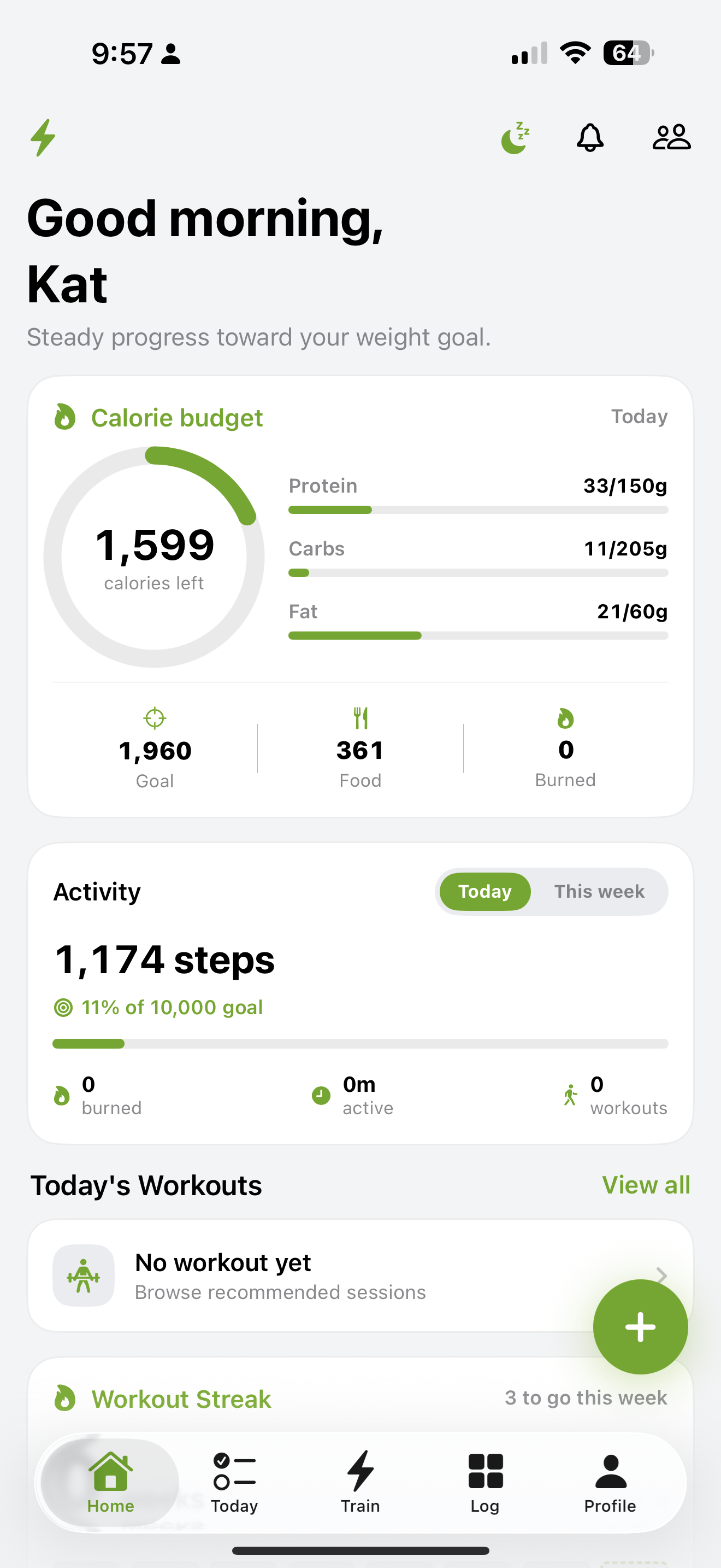
The system is designed for near-black. Light mode is a verified second skin — never the starting point.
Most of the screen is neutral. No emoji, no decoration — clean cards, real objects, heavy numbers.
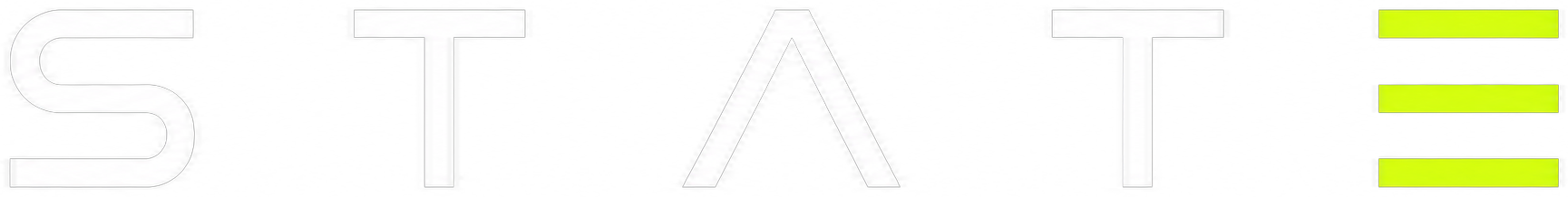
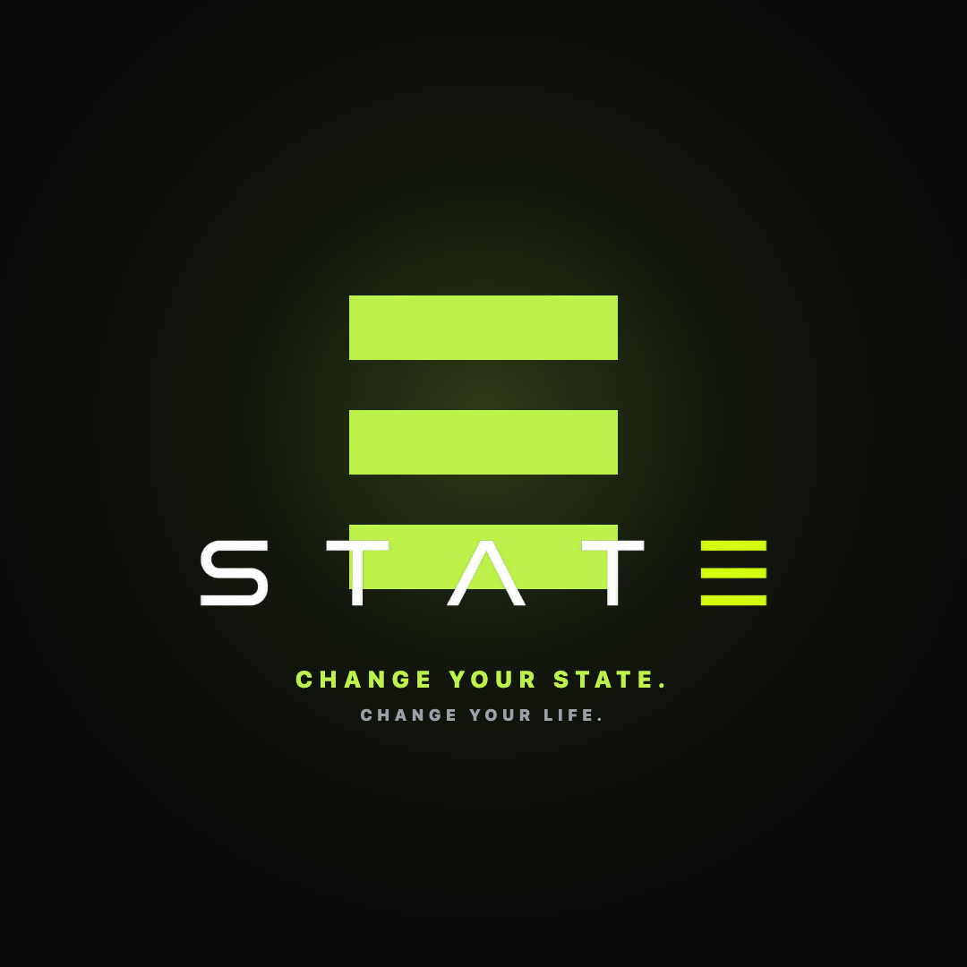
The wordmark & the E
bar width to height
gap is ~0.78 of bar height
square corners, no radius
Three stacked lime bars — the same three strokes that form the E in the wordmark. Use the mark solo for the app icon, avatars, and favicons.
120px wide on screen20mm in print
One mark. Every size.
Opaque, no alpha. The icon ships on a near-black field — never transparent — so it reads correctly in notifications, Settings, and on the Home Screen.
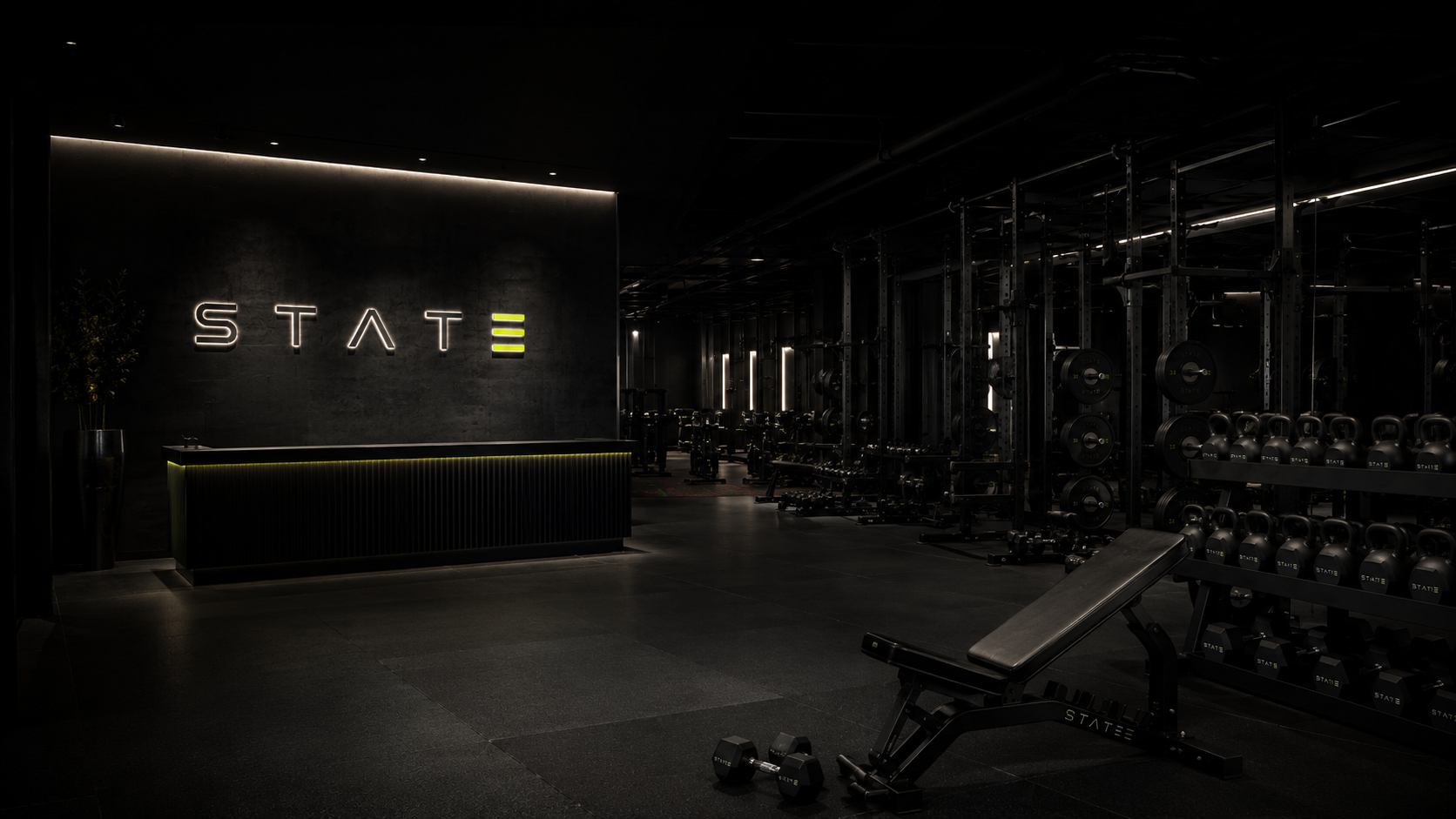
Built on near-black & one lime
Click any swatch to copy its hex. Each token carries a light and a dark value.
SF Pro, set bold
The system typeface. Display and numbers run semibold-to-bold; large stats use tabular figures for rock-steady alignment.
700 · -2.5%
700
700 · tnum
700
450
700 · caps
caps · lime
Components, the way they ship
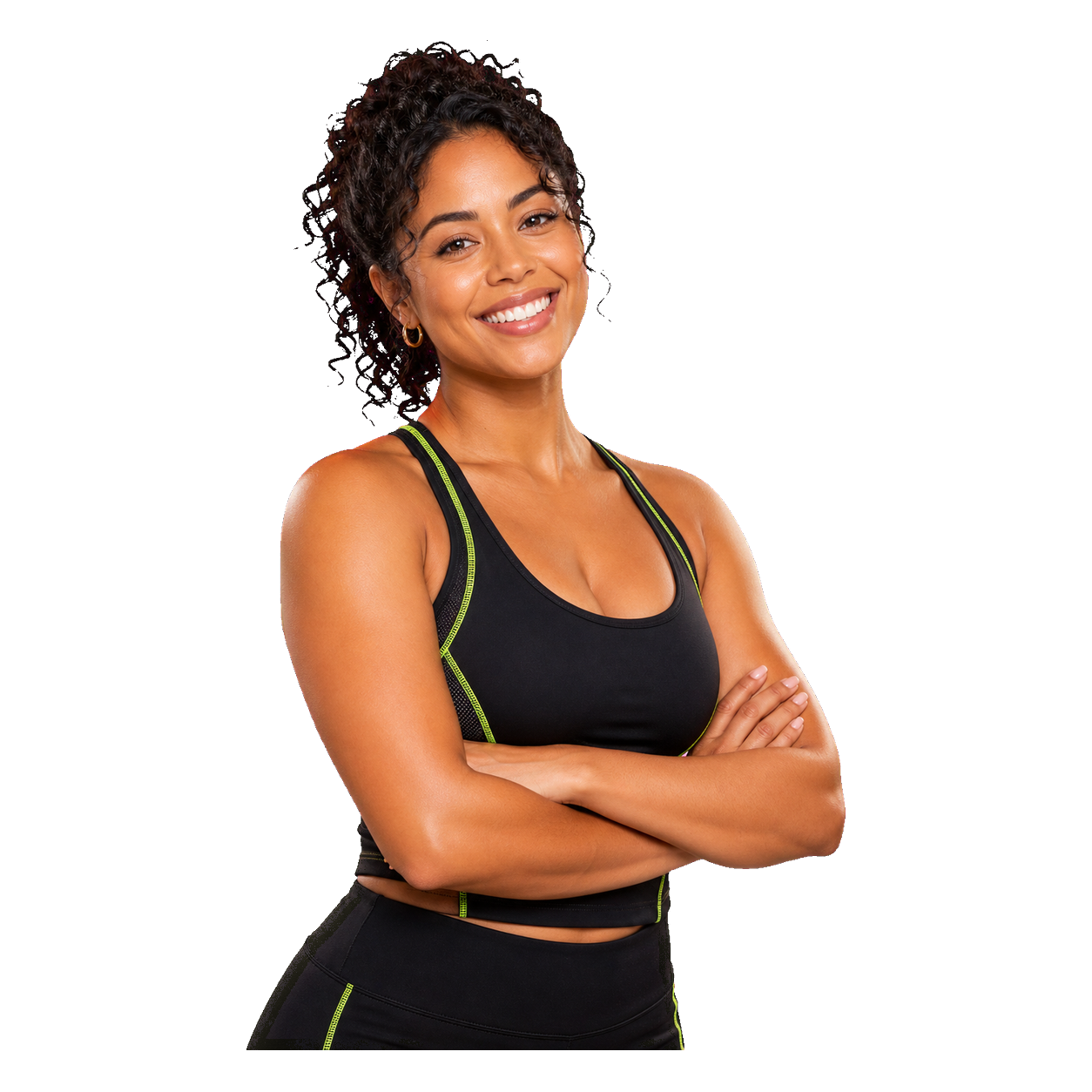
Eleven coaches, one personality
Every coach is a photoreal avatar, cut out and lit on near-black — never a colored backdrop. One lime accent ties the whole roster together.


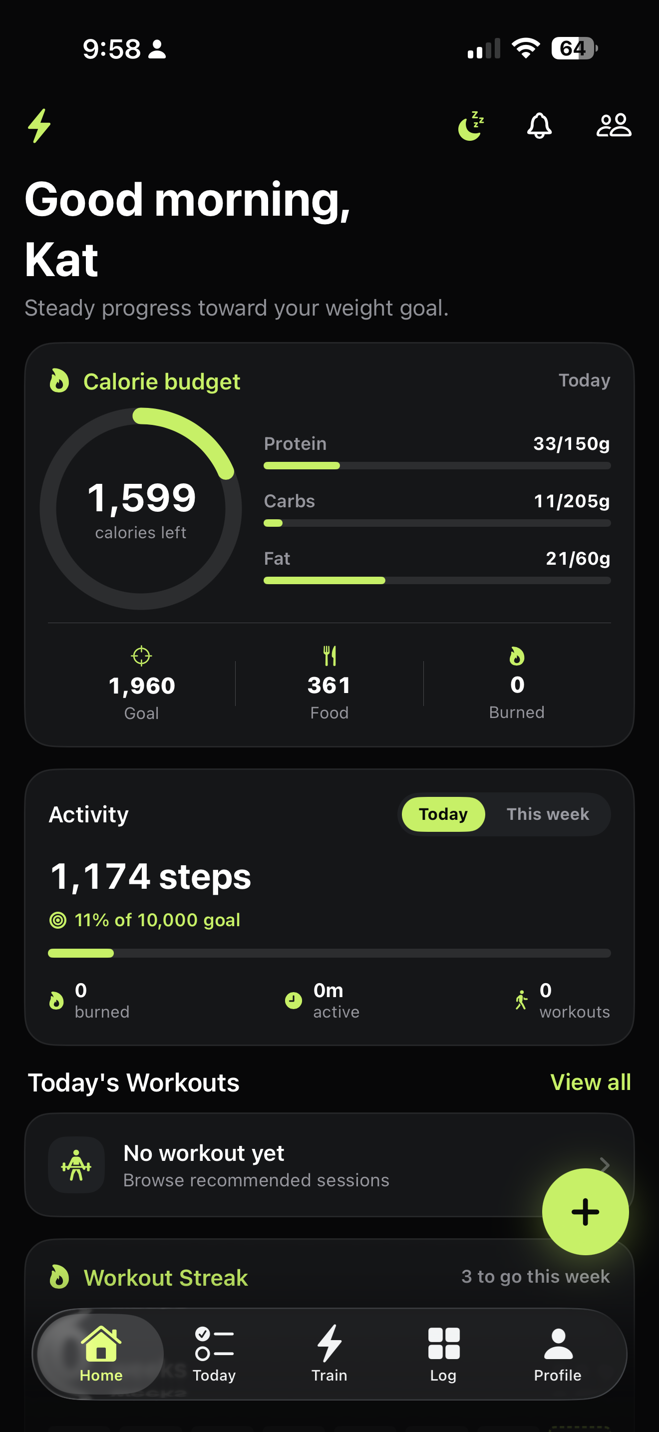
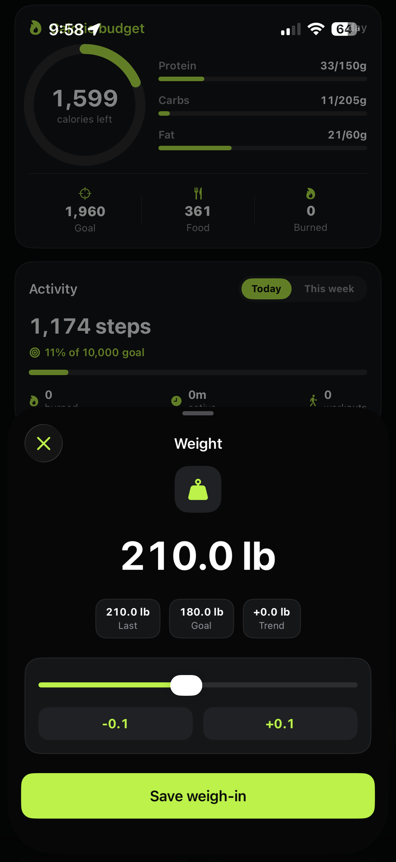
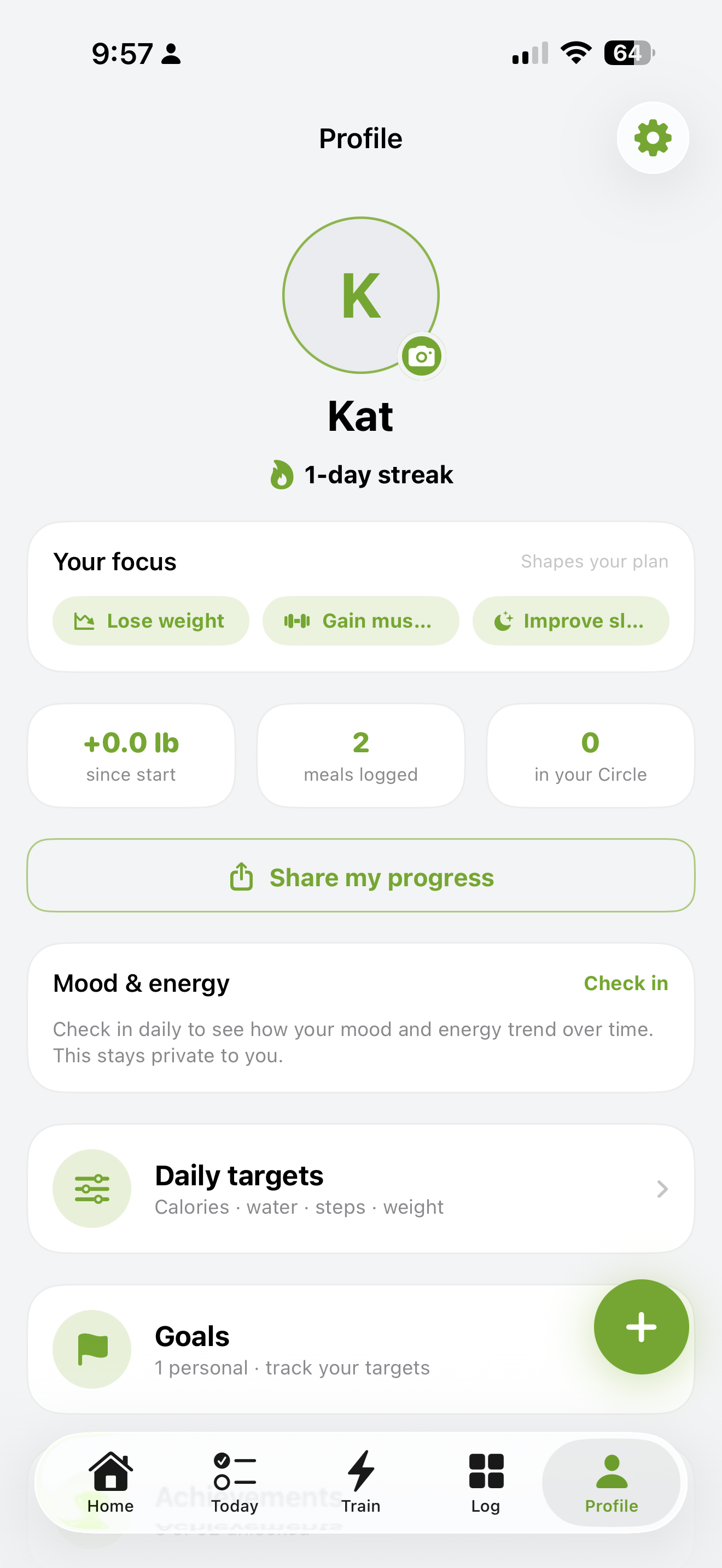
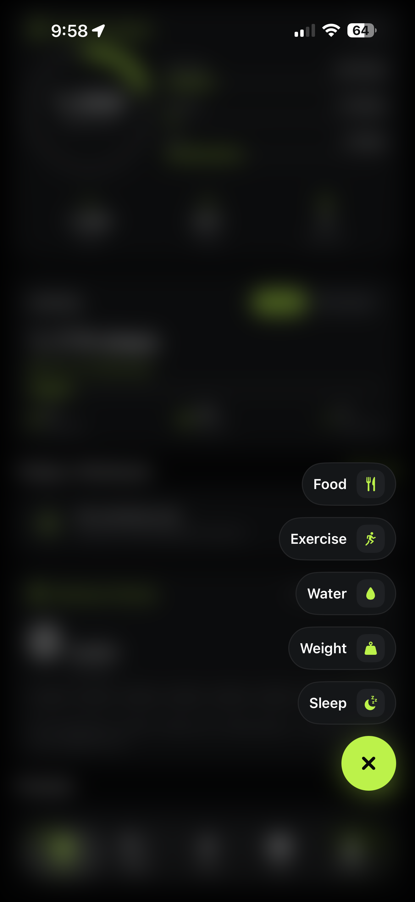
The system, shipping
Real product screens — proof the brand survives contact with the app. Dark by default, light when the moment calls for it.
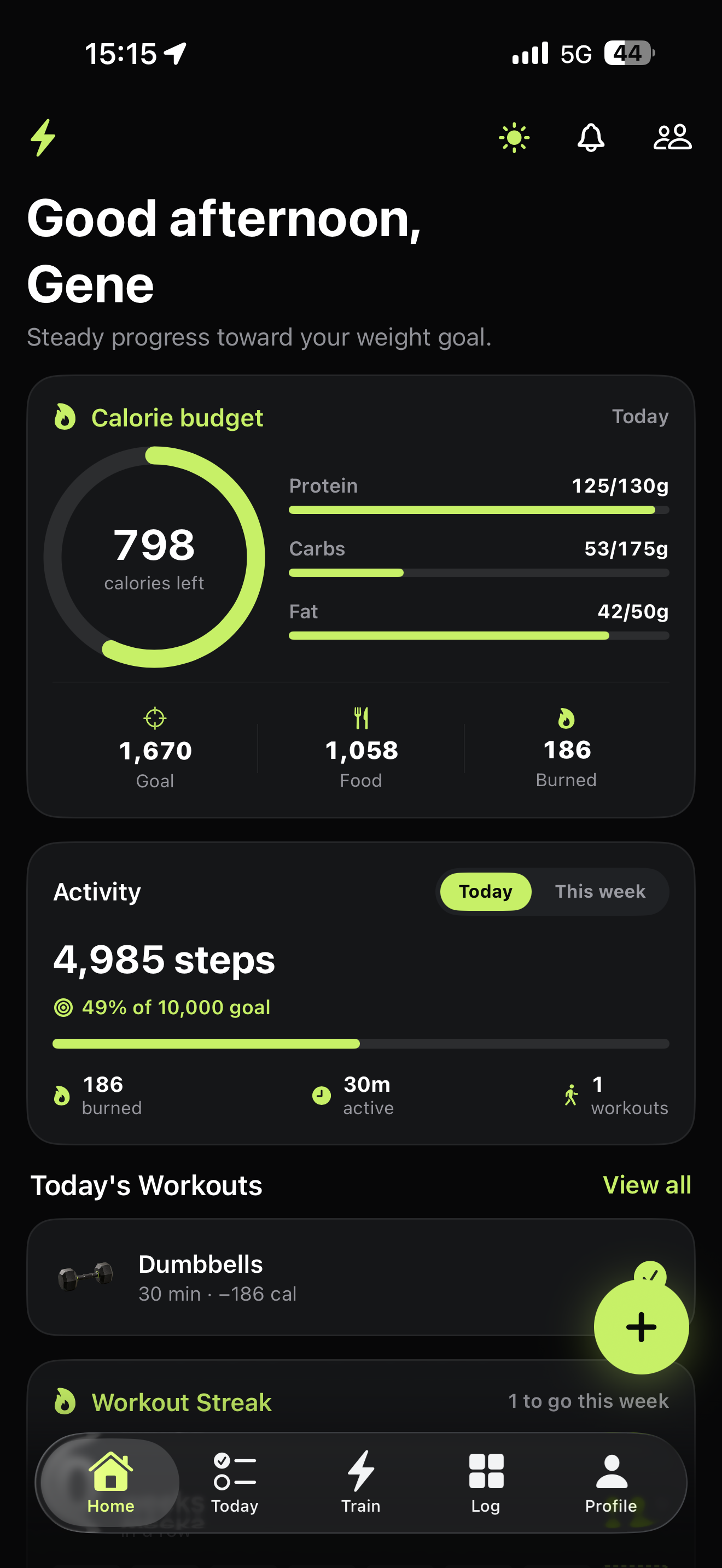
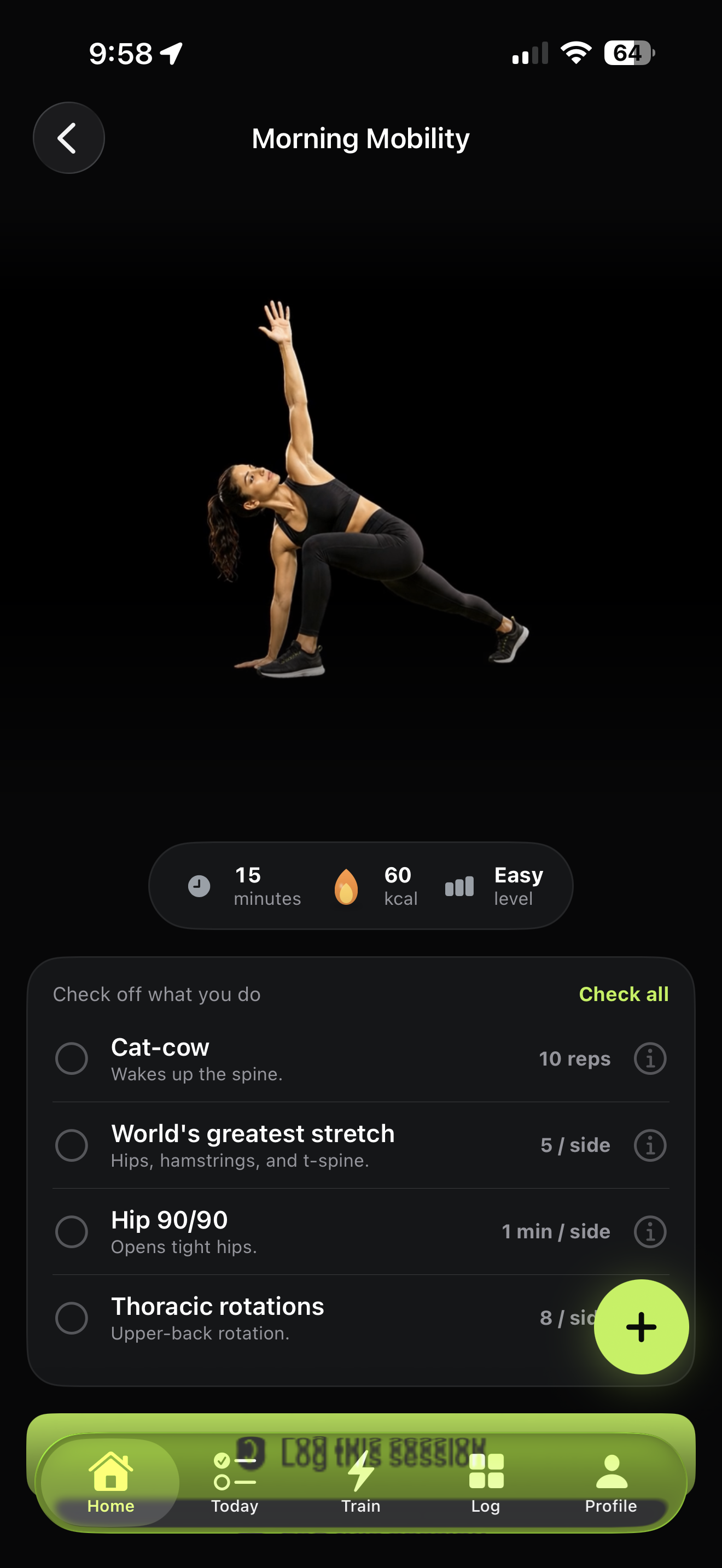
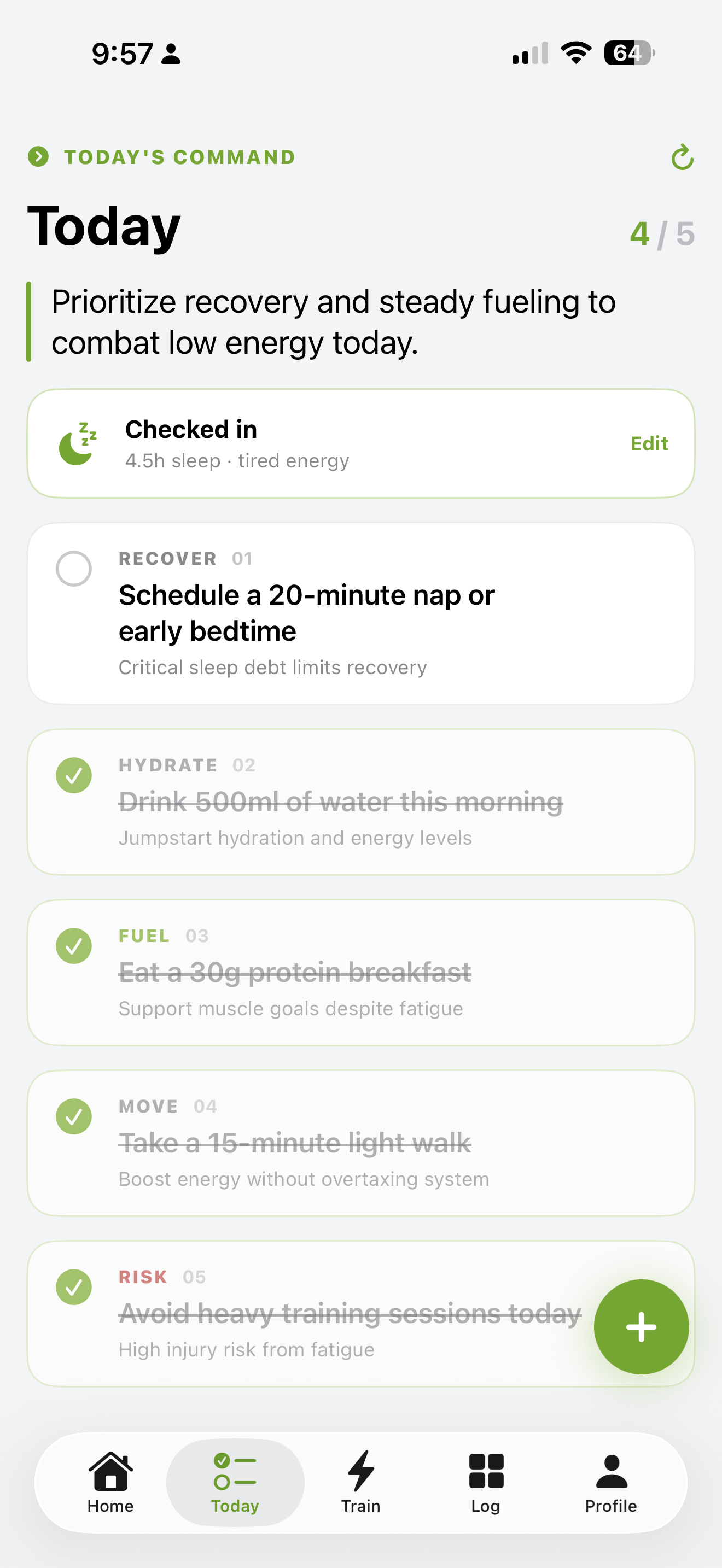
Three bars, line icons, real objects
SF Symbols weight — 2px stroke, rounded caps and joins. Lime when active, gray when idle.
Never emoji — anywhere. Replace with SF Symbols or the 3D object illustrations. The flame becomes the lime mark.
Change your state.
Change your life.
- ✓Direct & calm — a coach, not a cheerleader.
- ✓Plain words. "Prioritize recovery today."
- ✓Confident about progress, honest about effort.
- ✕Use emoji — in UI, copy, or notifications.
- ✕Hype, shame, or shout in many colors.
- ✕Bury the action under decoration.
Wear your state
Drop your product mockups into the slots below — they persist. Black blanks, lime mark, nothing else.
Download the media kit
Logo, brandmark, app icon, ready-to-post social formats, and product screenshots — correctly sized and named for press, partners, and posts.